Monday, April 27, 2009

Happy New Year from Jan Sawka

Very Polish psychedelic illustration from Polish illustrator and artist Jan Sawka for Polish art / design magazine Projekt. This was a New Year's 1975 greeting from the magazine.


Click for larger view

Friday, April 24, 2009

Philately Fridays: Japan, 1976


Love this one from Japan. It never ceases to amaze me how much can be said with so little. The shapes here are so minimal, but so clearly express the image of a family. I also really appreciate the visible texture of the ink.

Thursday, April 23, 2009

LOGO WARS IV


A few months ago, I posted this fantastic hand-drawn logo for THE ART GROUP. Not on some Logo Wars shit, but just on some typographic craftsmanship appreciation.


So everything was fine and good within the realm of The Art Group up until yesterday when I stumbled upon this gem, created by French typographer Claude Mediavilla:


As far as I know, these were both created at about the same time.

LET'S GET READY TO RUMBLLLLLLLE

Wednesday, April 22, 2009

Tiparillo cigars

I never thought something as vile and nauseous as the smell of cigar smoke could be associated with something so attractive as these brightly-colored illustrations of European-style villages on the packages of Tiparillo cigars from the early 1980s. There's this guy in our building who smokes mad cigars every couple of days and that stomach-turning stench seeps into our office. Whatever floats your boat dude. Maybe he's smoking circa-1980 Tiparillos?


Click for larger view

Tuesday, April 21, 2009

Buffalo Bill's Wild West

Here's a magazine ad for a rootin'-tootin' cowboy show. I love the chunky, late '70s illustration and typography style used to create an image so clearly "wild west" and how it fits together so effortlessly. There's something about the complexity of typography from the era just before computers came around that hearkens to the turn-of-the-20th century graphic arts. This image is so 1981 and so 1901 at the same time. Thoughts?


Click for larger view

Monday, April 20, 2009

Judging Books by their Covers, Madison edition

I spent the weekend in Madison, Wisconsin and had time to check out a few used book stores. I came across a few gems, but here are some photos of some of the books I didn't take home with me.


Lovely illustration with non-flamboyant Avant Garde typeface.


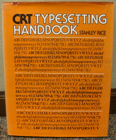
A typeface thesaurus with Serif Gothic (also designed by Avant Garde desiger Herb Lubalin) type for the title.


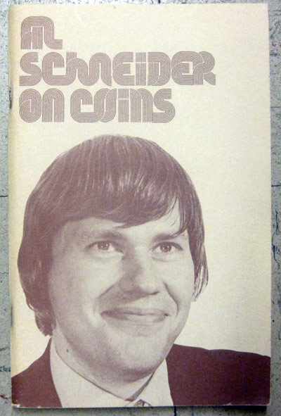
I thought this book was gonna be about coin collecting but it was actually a sleight-of-hand instructional manual. Hilarious. I can't remember the name of the font in the title but I think I have the Letraset sheet at home.


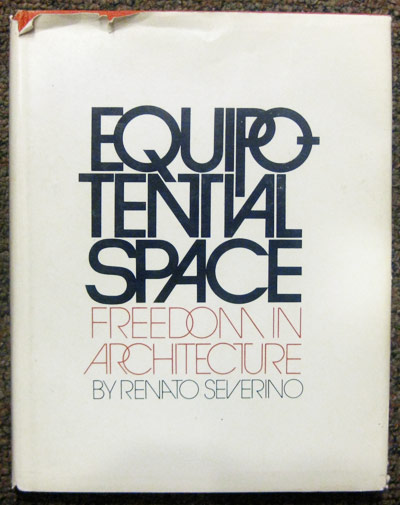
Whoever layed out this type HANDLED IT. So so fresh. This was also the first time I'd ever seen the word "equipotential."

Friday, April 17, 2009

Philately Fridays: Brazil, 1976


As much as I love the wild, lawless psychedelic illustrations from the '70s, I'm also a sucker for simple and organized geometry and patterns. Perfect example right here from Brazil.

Thursday, April 16, 2009

Lubalin for Young Audiences

Herb Lubalin & crew get it in for young music and theater lovers in N.Y.

Friday, April 10, 2009

Philately Fridays: Germany, 1986


Love these two stamps from Germany. Geometric illustrations from 1986 for the Show Jumping World Championship and the European Junior Swimming Championships.


BONUS FACT: The name of the winning horse in the 1986 jumping championship? Mr. T.

Thursday, April 9, 2009

Disney Week: Vacationland


I've been wanting to show this magazine cover since day one of this blog. It's one of my absolute favorites.


Click for larger view

Wednesday, April 8, 2009

Disney Week: Old timey stuff


As they proved with EPCOT, Disney really excelled with the contemporary and futuristic style of design. They also really nailed the super-ornamental early 20th century styles and seamlessly mixed them with more contemporary design techniques.

Here's a printed mirror I found in a thrift store for the Big Thunder Mountain Railroad. Sorry for the bad photo - mirrors are really hard to photograph. Go figure.

Click for larger view

...and a hand-painted mural from Disneyland in California:

Click for larger view

Tuesday, April 7, 2009

Disney Week: EPCOT Center brochure


Disney Week continues with a brochure from EPCOT Center's opening year, 1982. I remember EPCOT Center in its heyday, and the young nerd in me liked it way better than Disney World. The vision of the future, the fascination of science and technology, the melting pot of world cultures, and this sharp and cleverly-designed map and travel guide.


The wheel on the bottom can be turned to reveal different information about the different countries represented at EPCOT's World Showcase. On the back of the brochure, the wheel serves a second purpose as part of a Kodak advertisement, listing different camera facts at the turn of the wheel.


Monday, April 6, 2009

Disney Week: Magic Kingdom brochure


That's right. Disney Week. All this week I'll be showing some well-designed Disney promotional material and merchandise from way back when.

We'll be taking a look at the fantastic graphics and typography used to promote their movies, theme parks, and other elements of their beloved and hated legacy.

I'll start things off with a brochure from the Magic Kingdom, circa 1981.


Click for larger view


Friday, April 3, 2009

Philately Fridays: Israel 1967


Here's a set of 5 Israeli stamps to commemorate the new year in 1967. Lots of cool patterns happening in these decorative depictions of the Torah.


Thursday, April 2, 2009

Giant Disco Singles

Cause it's a whole lot better than printing up plain black sleeves for your disco singles! Here are a few examples of some of the hotter than hot disco 12" sleeves from major and slightly minor record labels...